How to Explain Graphs In a PTE Test (Step-by-step Guide)

The PTE Describe Image is considered to be a hard task in the exam. Many test-takers need help finding out how to explain graphs in the PTE test.?
Fear not, as this blog will go through the task format and provide you with a step-by-step guide. PTE Magic also offers templates and tips for easy study and preparation. Stay tuned!
How to FINALLY Pass the PTE and Achieve Your Dreams
Stop guessing! Start using proven methods that guarantee results!
? Master Every Section: Discover INSIDER SECRETS that secure HIGH SCORES. ? Save Time & Effort: Study SMARTER with proven strategies for FAST results. ? Real Practice, Real Confidence: Practice with TEST-LIKE questions to feel FULLY PREPARED.
START YOUR PTE SUCCESS JOURNEY TODAY
|
Key Takeaways
- The PTE Describe Image task tests your ability to talk about images clearly and efficiently with around six images.
- The scoring is based on three main factors: content, pronunciation, and oral fluency.
- This section introduces several common types of graph images, including pie charts, line graphs, and bar graphs.
- The tips below will help you perform your best in the PTE test.
Related:
- PTE Magic’s #1 PTE course to help you pass the test in just 30 days!
- The ultimate guide to PTE exam preparation
Overview of the PTE Describe Image Task

The PTE Describe Image task tests your ability to talk about images clearly and efficiently. You?ll have around six images to describe, with each being various?from graphs, maps, and diagrams to photos. Test-takers will have 25 seconds to look at the image and then 40 seconds to describe what they see.
The scoring is based on three main factors:
- Content: You?ll be scored on a scale of 0 to 5. You get the most points by covering all the important details. PTE Magic suggests aiming to mention about 12 key points from the image to score full marks in this category.
- Pronunciation: Also scored from 0 to 5. Clear, accurate pronunciation is crucial to scoring well here.
- Oral fluency: Similarly, it?s scored from 0 to 5. You need to speak without awkward pauses to earn top marks. Test-takers who speak confidently will have a higher fluency score.
How To Explain Graphs in the PTE Test
Here?s a simple strategy that you can follow to make the task easier:
- Step 1. Set an introduction: Start with a quick introduction. Just say what the graph is about straightforwardly, for example, “This graph shows the trend in…”. Keep it simple.
- Step 2. Briefly mention the main features: Now, look at the picture and focus on the high and low points or any noticeable trends. Pay attention to any spikes or downward slopes. The key is to mention the most eye-catching details.
- Step 3. Get specific with the details: Talk about straightforwardly what the graph is about numbers, percentages, or key data points that back up what you just said. This is where you bring the facts to support your earlier observations.
- Step 4: Wrap up with a conclusion: If there?s time, finish with a quick summary or conclusion. For example, a concluding sentence similar to this: ?In summary, the graph shows an overall increase in…? will do.
PTE Graph Templates And Examples
This section introduces several common types of graph images that test-takers will encounter in the PTE Describe Image task. Let?s find out below.
Pie Chart

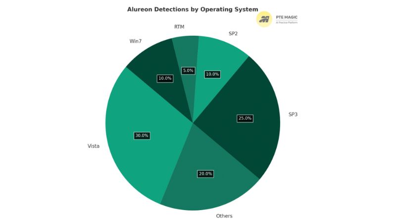
Based on the steps we outlined above, here?s how you can generally describe this pie graph:
- Step 1. Introduction: ?This pie chart shows the distribution of Alureon detections across different operating systems.?
- Step 2. Main features: ?The largest share of detections is found on Vista, which accounts for 30% of the total. SP3 follows with 25%, and the “Others” category makes up 20%. Meanwhile, Win7 and SP2 each represent 10%, and RTM has the smallest portion at 5%.?
- Step 3. Details: Specifically, the breakdown is as follows: Vista leads at 30%, SP3 is second with 25%, followed by “Others” at 20%. Both Win7 and SP2 contribute equally, at 10%, while RTM only shows 5%.
- Step 4. Conclusion: In summary, Vista and SP3 represent the majority of Alureon detections, with the smallest share being found on RTM.
Line Graph

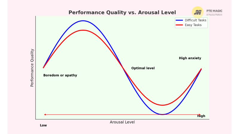
Let?s break down the steps for this graph type:
- Step 1. Introduction: ?This graph shows the relationship between performance quality and arousal level for easy and difficult tasks.?
- Step 2. Main features: ?The blue line is for difficult tasks, and the red line is for easy tasks. There are three main states based on the arousal level: Boredom or apathy, optimal level, and high anxiety.
- Step 3. Details: ?When arousal is low, people get bored and performance is poor. As arousal increases, performance improves until it reaches the best optimal level. But if arousal gets too high, people become anxious and performance drops again. This is more noticeable with difficult tasks.?
- Step 4. Conclusion: ?In summary, the graph suggests that performance quality depends on finding the right balance of arousal, especially with difficult tasks.?
Bar Graph

These are the steps to describe the bar graph:
- Step 1. Introduction: ?This bar graph shows the population of males and females in different age groups in Luxembourg in 2016.?
- Step 2. Main features: ?The blue bars represent males, and the red bars represent females. In most age groups, the male and female populations are fairly similar, but there are some noticeable differences in certain age ranges.?
- Step 3. Details: The age group 20-24 has the highest population, with more females than males, reaching over 700,000. The population significantly decreases after age 75, especially for males. Younger age groups, like 0-4 and 5-9, have a balanced number of males and females.
- Step 4. Conclusion: ?In conclusion, this graph shows that Luxembourg has a larger female population in the older age groups. The population peaks around the 20-24 age group.?
5 Tips to Master the PTE Describe Image Task
Understanding the graph types is one thing, but knowing how to answer them effectively is what counts most. Check out the tips below to perform your best in the PTE test:
- Focus on the key information: When you see an image, don?t confuse yourself with the details. Ask yourself: what?s the core idea here? Focus on the context?the axes, units, the title, and the crucial data points.
- Use your time wisely: Spend a quick 25 seconds to observe the image. Don?t rush; take a breath. Find the key information before answering.
- Use proper vocabulary: Describing trends isn?t just about stating the obvious. Mix up your vocabulary. Use terms like ?increase,? ?decrease,? ?rise,? or ?steady? to show some linguistic flair.
- Speak clearly: When it?s time to speak, clarity is key. Keep a steady pace and make sure the computer system can follow without a struggle.
- Practise makes perfect: Practice is non-negotiable. The more graphs, charts, or tables you?ve practised, the more natural it will feel. Different visuals won?t be a problem because you?re ready.
Frequently Asked Questions
How Important Is The PTE Describe Image Task?
The PTE Describe Image task may sound simple, but take it seriously. This task requires a sharp eye and the ability to talk through what you see. It?s not just about describing?how well you describe the image will decide your score. Get this part right, and you can boost your overall score greatly.
What Should You Say When Describing A Graph?
Describing a graph is not reciting every number. You start by giving a broad introduction “Overall, the graph shows…” or “What stands out is…”. Then, highlight key points?focus on the sharp rises, sudden dips, and steady plateaus. Use phrases like, “I’d like to focus on…” or “A significant trend here is…” Don?t use complicated words that can confuse yourself?use clear, simple language.
How Many Questions Appear in the Describe Image PTE Task?
Typically, you?ll face 6 or 7 questions in the PTE Describe Image section. But don?t get too distracted?this section is all about how well you speak, not how closely you examine the picture. Your score is only applied to the speaking skills.?
Final Thoughts
We hope you know how to explain graphs in the PTE test at the end of this blog. Aside from all the tips above, keeping a confident mind and believing in yourself is what counts. Check out other sections? formats and tips at PTE Magic to conquer your test. Cheers!
How to FINALLY Pass the PTE and Achieve Your Dreams
Stop guessing! Start using proven methods that guarantee results!
? Master Every Section: Discover INSIDER SECRETS that secure HIGH SCORES. ? Save Time & Effort: Study SMARTER with proven strategies for FAST results. ? Real Practice, Real Confidence: Practice with TEST-LIKE questions to feel FULLY PREPARED.
START YOUR PTE SUCCESS JOURNEY TODAY
|

